Note: This article is outdated. See Custom Analytics Dashboards
In OneDesk, dashboards are a type of ‘view’ which are displayed in the left panel and show you some useful charts and statistics about your data. You can create and save your own dashboard-views, just like you can create tree-views, card-views, Gantt-views, etc.
The two kinds of dashboards
1. Item-data dashboards
These dashboards show data on what is inside of projects and report on the items themselves (such as tickets, tasks, etc). You can find the default dashboard in the views list inside the tickets or tasks application.
The project-level can be set to any level and will impact the data displayed in the dashboard. Therefore as you change project-levels the dashboard will update to reflect the statistics for the selected level.
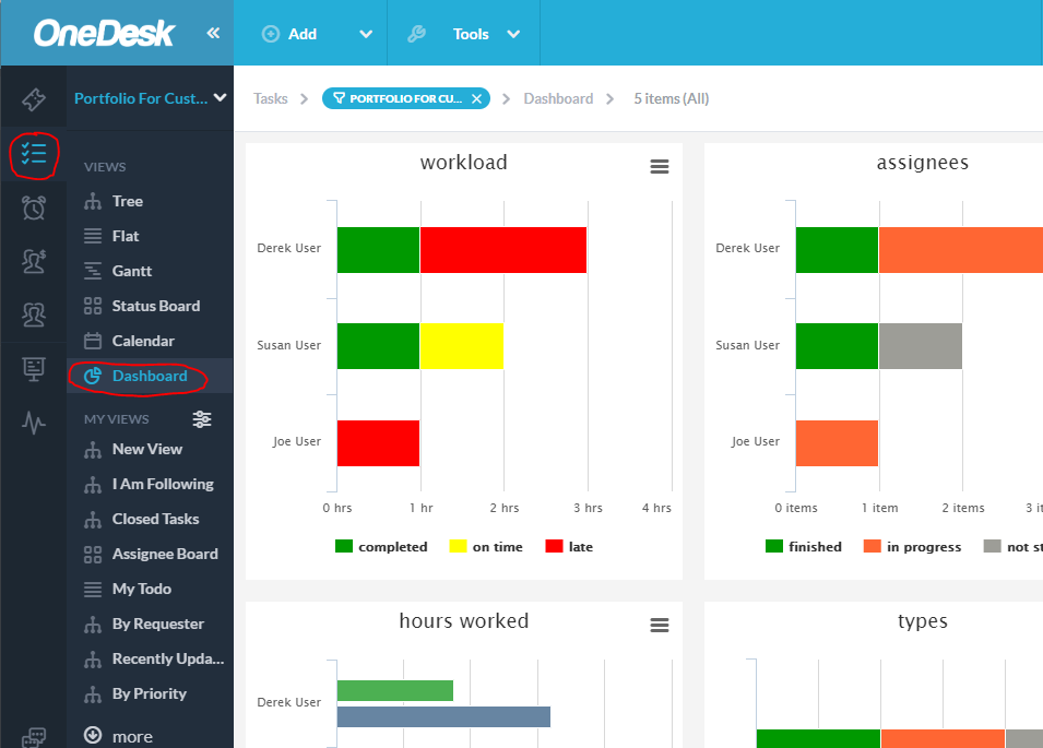
This dashboard contains the following chart widgets:
- Workload – a bar-chart of the hours of assigned work by team member, broken down by: completed, on-time, or late.
- Assignees – a bar-chart of the number of assignments per user broken down by the status of that item.
- Hours Worked – a double-bar-chart of the hours per user, comparing their planned work vs. their actual work
- Types – a breakdown of the types of items, and their status-state
- Priorities – a breakdown of your items by their priority, from 0-5 stars
- Source – a pie chart of the various sources of your items, such as: from email, manually entered, from the portal-form, etc.
- Authors – a pie chart of the top authors of your items
- Top Customers – a pie chart of your most prolific customers in terms of items requested by them
- Top Customer Organizations – a pie chart of your most prolific customer-organizations in terms of items requested by them
2. Portfolio-data (multi-project) Dashboards
In OneDesk when you are looking at one or more projects there are some stats that are available that would not make sense at a lower level. These charts show you how the projects themselves change over time, or how projects compare to others. Therefore these dashboards contain additional charts.
You can find these dashboards in the Dashboard view of the “projects” application. Once again the project-level selection matters and if for example you are at a portfolio-level, this dashboard will show the data for the projects inside that portfolio.
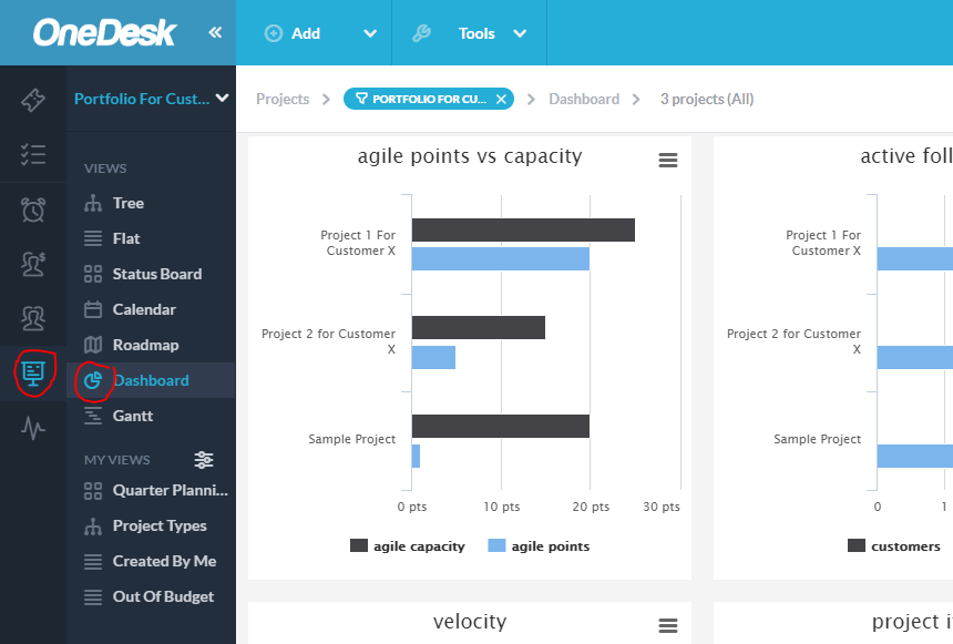
In addition to all the chart widgets listed above, this dashboard also includes: - %complete by project – a bar chart comparing all the projects’ completion both in actual % complete and expected % complete.
- Agile points vs. capacity – a double-bar chart for each project comparing agile points vs capacity.
- Active followers – a double-bar chart for each project showing the number of followers for both users and customers.
- Velocity – a velocity chart comparing project-work completed both in terms of points and hours worked
- Project Items – a bar chart comparing projects in terms of number of items in each status state.
- Project Status – a bar chart that breaks down the status-states of the projects themselves
Timeseries charts: For these charts you can define the time period you wish to include in the data. - Burndown by project – a time-series line chart showing the number of items not closed over time.
- Created vs resolved – a time-series chart showing the number of items created and closed over time
- Burndown – a time-series chart showing the work remaining over time, in terms of hours, tasks, and points
- Planned vs actual work – a time-series chart showing the decline on planned work, and increase in actual work (hopefully) over time.
- Total hours worked – a time-series bar-chart showing the total number of hours worked per day over time
- Hours worked by resource – a time-series bar-chart showing the total number of hours worked per day over time per user.
- Modified items – a time-series bar chart showing the number of items modified per day.
How to create your own filtered dashboard
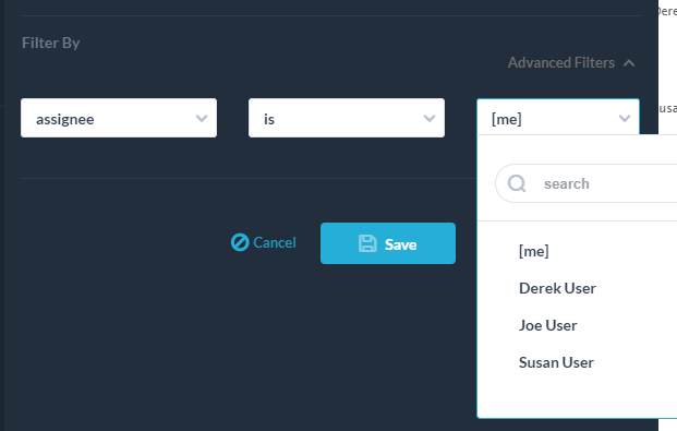
You may want to have a dashboard that is only looking at a subset of the data. For example you may want a personal dashboard that is only for tasks assigned to you or requested by a specific customer organization. You can do this easily, in the same way that you create any other view. Here’s how:
- Navigate to the project or items application depending on the charts you need
- Click the create view button
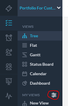
- Select the “dashboard” layout
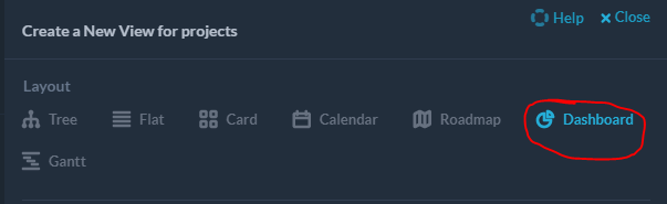
- Add any filters you want.
- Click ‘save’ and name your new view
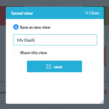
- You new dashboard is saved in the “my views” list. You can now see a dashboard of widgets that is only calculated from the stuff you included.