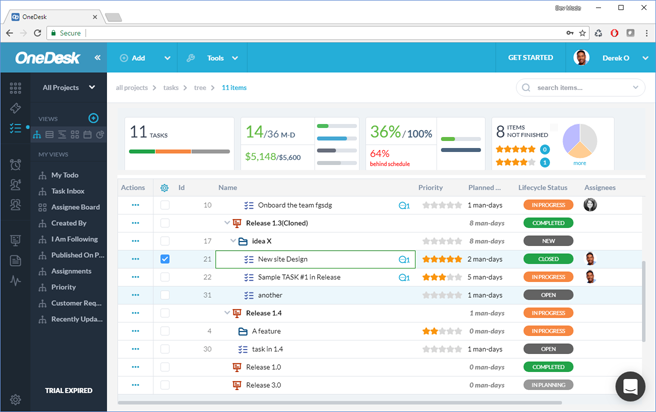
It’s been a while since OneDesk had an interface refresh, though those of you who have been with us for a while will remember past updates. So without further ado, I would like you to meet the new OneDesk! This update will be rolled out to all accounts the week of April 23 to 27th.

New icons, new colors, modern style!
Our design team has worked hard to maintain the spirit of OneDesk while completely modernizing the colors, graphics and styles. Since some icons are user-customizable in you may not see all the new icons in your account, but if you want to use them, they are available for you in the icon library.
New technology, new components
From a technology standpoint our team has developed an entirely new library of UI components, moving away from GWT’s widget-based approach and towards the new GWT Elemental technology. There was a lot we needed to discover and develop here, but the end result is a very extensive library of Elemental components. There is still more to do, but if you want to know more about this, ask us!
More friendly and collaborative.
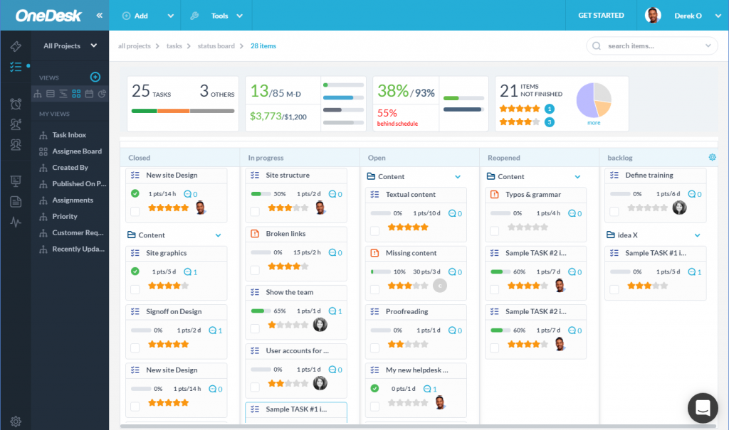
Enterprise applications don’t have to look boring, so we did what we could to liven up your screen. We added user avatars where we could, spaced things out a bit more, and applied consistent design patterns everywhere.
Modern design, cleaner lines and layout.
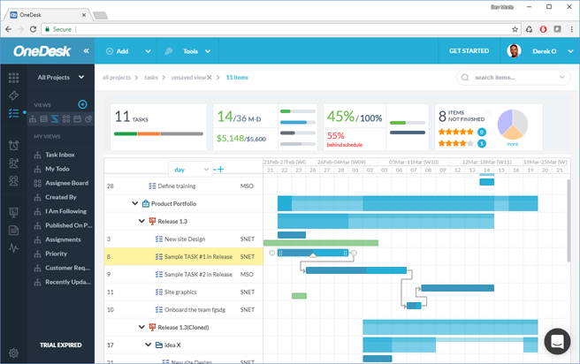
Sometimes less is more and we decided to embrace this in our latest release. Now the details panel can be detached from the right of the screen to give more real-estate to your tasks-list, cards or gantt chart. In fact we liked this look so much that we made “off” the default for new users. Try it out and see if you prefer more space or always-visible details. We also removed duplicate links and generally cleaned things up.
More on the way!
There are 3 big pieces of the interface that have not yet received their makeover. They are, the administration panel, the mobile app and the customer portal. These are next on our list, and we are very excited about the new dsigns we have planned. So stay tuned!
Some more pictures
Since one screenshot doesn’t tell the whole story, here are a couple more:


