We have released an update to the report creation interface. This a big step forward for non-technical users to be able to generate and schedule the reports they need. While the underlying report generation technology has not changed, the interface has become a lot more user-friendly and intuitive.
In the prior version, the user was presented with a first screen that they had to complete to generate the template, and then a second screen to determine the report scope and schedule. In addition, the user was asked to select a XLS layout which required experience with Excel templates that most people do not have.
Now the user is presented with a Wizard-like interface that walks them through the choices necessary to generate the report they want. There are a few paths through the wizard, with each path asking only the information required, in the order required. The XLS layouts are selected for them based upon their choices, and the user is only asked for the minimum information required to generate each report.
In upcoming releases we also plan on pre-creating report templates for many different situations. Currently only the “invoice” template has been added. Please let us know in chat or comments what pre-built reports you would like to see included.
Walk-Through of the new Report Wizard
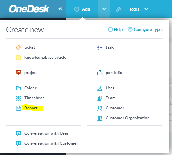
To create a new report, select “report” from the top Add menu.
Choose the type of report you want to Generate
In this step, you select from a pre-configured report (at this point only “Invoice” – more coming soon) and a custom report.
When selecting a custom report, you can choose from a table, grouped table, table with pie-chart, or table with Line Chart. Advanced users can also select to use their own Excel layout file.
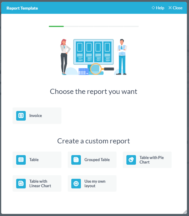
Each selection here will take you through a different path through the wizard. If you choose wrongly at this step you will need to start again.
For this example, we are going to choose “Table with pie chart”.
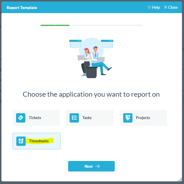
Choose the application to report on
Here you select the OneDesk application you would like to generate a report on. You can choose, tasks, tickets, timesheets, projects, and Features (if you have that app turned on).
For this example, I would like to get a breakdown of the billable work performed by my team on a certain portfolio of projects over the last 30 days. I will therefore select “Timesheets” and click ‘Next’.
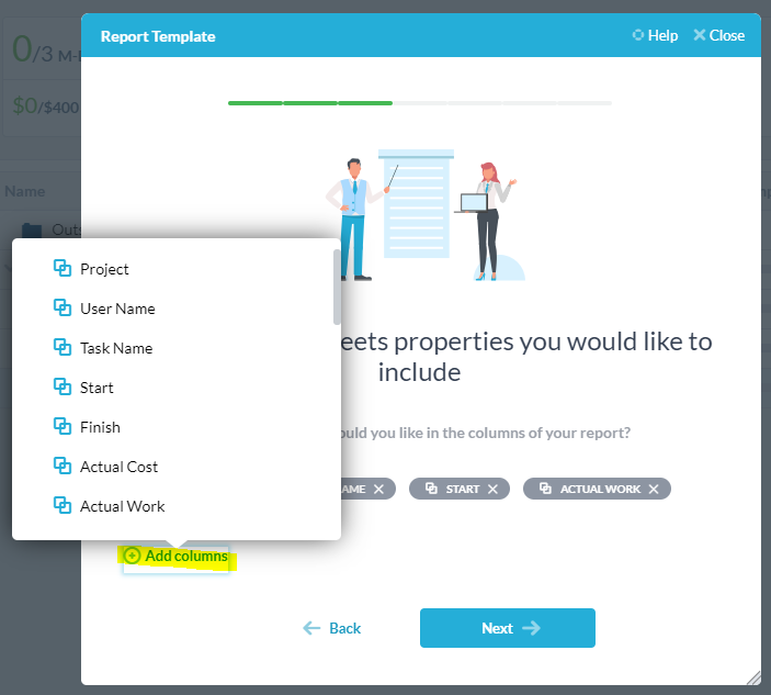
Choose the properties you would like to include
In this screen, I can select which properties I would like to appear as columns in my report. It is important to note that I must include columns for properties that I wich to use in my chart.
For my example, I will add the User name (assignee), task name, start and actual work.
Choose the items you would like to appear in your report
Here I will further filter down the item included in my report by selecting the project-level and adding filters.
For my example, I am selecting the portfolio of projects for Customer X. I am only including timesheets from the last 30-days and only billable timesheets.

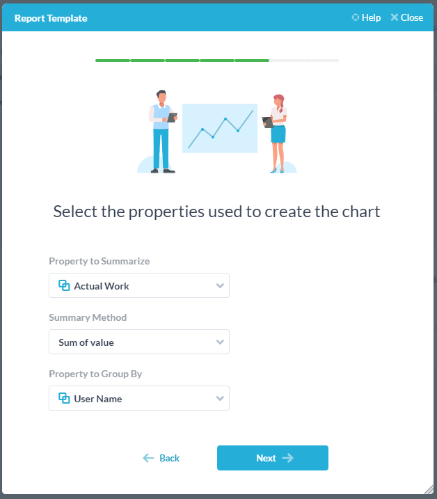
Select the properties used to create the chart
On this screen, I will determine how the pie chart is to be constructed.
For my example, I would like a pie with each slice representing the work done by an assignee. I will therefore select ‘Actual Work’ as the property I would like to summarize. I would like to sum the work (not count the timesheets), so I will select ‘Sum of value’. I would like the results grouped by the assignee, so I will select to group by ‘User Name’.
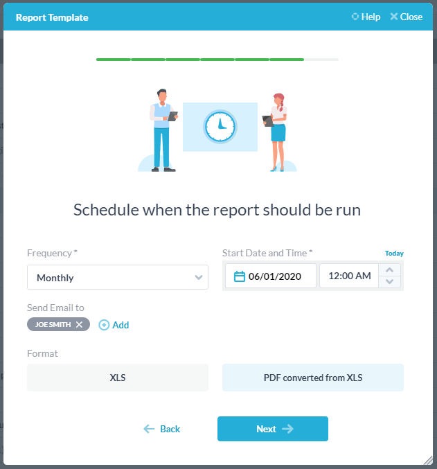
Schedule when the report should be run.
here you can select the Frequency of the report and who (if anybody) you would like the report to be emailed to.
For my example, I would like the report generated Monthly, starting on the 1st at 12AM. I am sending the report by email but it will also be available under “My reports” in OneDesk. I am choosing XLS as the output format.
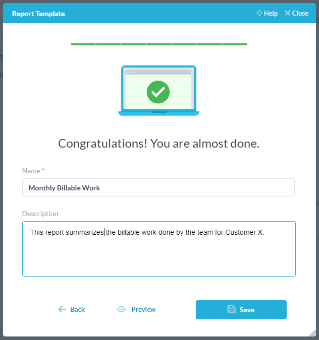
Give your report a name and description
Here you can give your report a name and description. You can preview what the report will look like and if you like it you can save it. If you want to make changes you can click the back arrow and alter the decisions you made in previous steps.
Previewing the report
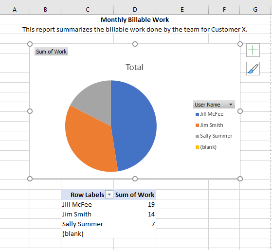
For my example, here is what my report looked like after clicking “preview”.
First I get a non-editable Excel which I then have to click to enable editing. I may also need to refresh the pivot chart or pivot table data by right clicking on it and selection “Refresh Data”.
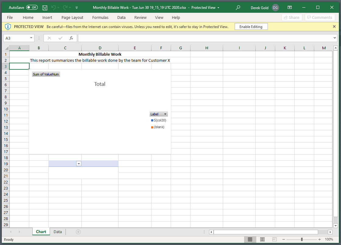
The End report will look something like this. It is an excel document which I can then modify if I want to. The document consists of 2 tabs, the report itself and the data from which the report was generated.
Managing saved reports
After you are happy with your preview, you can click “Save”. This will save the report template and run it on your data on your defined schedule. If you chose to have the reports emailed out, they will be sent, but even if you did not, the reports can be found under “My reports” found in the name menu in the upper right corner of OneDesk (scroll t the bottom).
The report templates and schedules are also saved under “My reports”. Here you can also modify a report template or the schedule upon which the report is run. You can even add multiple schedules to the same template. When modifying a template, however you will likely find it easier to step through the wizard again, rather than modify a templates porperties after the fact.