Components of a KPI dashboard
KPIs or Key Performance Indicators, are measurements that determine how well your organization is meeting its goals and objectives. KPIs are crucial to making data-driven decisions for your business. KPI dashboards provide a single screen of useful charts and graphs to easily measure your progress and performance. As such, when determining what KPI charts to use, consider your industry focus, project planning methodology, and business goals.
OneDesk’s real-time KPI charts
OneDesk offers a variety of real-time charts to measure many KPIs. These charts are found within the Analytics application in OneDesk. Since OneDesk combines help desk and project management, charts can be used to analyze data on tickets, tasks, team performance and workload, and projects. By default, charts are grouped together into “Chart Series”. You can easily add charts of your choosing to create a customized KPI dashboard. Your custom dashboards are then saved on your side “Views” panel and allow you to easily analyze different KPIs or metrics by select the desired dashboard you have configured. When creating a chart dashboard, consider what purpose it will serve as well as the needs of your business.
We’ve compiled some example chart dashboards. Each dashboard is grouped according to the business goals it serves.
For a guide on how to start creating a custom dashboard, please see Create a Custom Chart Dashboard
Table of contents
- Customer pain points
- Customer satisfaction
- Support team performance
- Team workload
- Improve resource management
- General help desk analytics
- General project management analytics
- DevOps
- Agile project management
(Bold indicates the “Chart Series” in OneDesk. “Quotes” indicate the name of the OneDesk chart. )
Dashboard: customer pain points
The purpose of this dashboard is to help identify common customer issues.Customer pain points depend largely on the type of business you run. However, it is useful to identify such problems as the type of issues customers are submitting, to where in the customer journey issues are occurring.
Customer Satisfaction –> “Satisfaction score & median requester wait time”
Customer satisfaction –> “Good vs bad customer satisfaction”
Customer satisfaction –> “Satisfaction score by property”
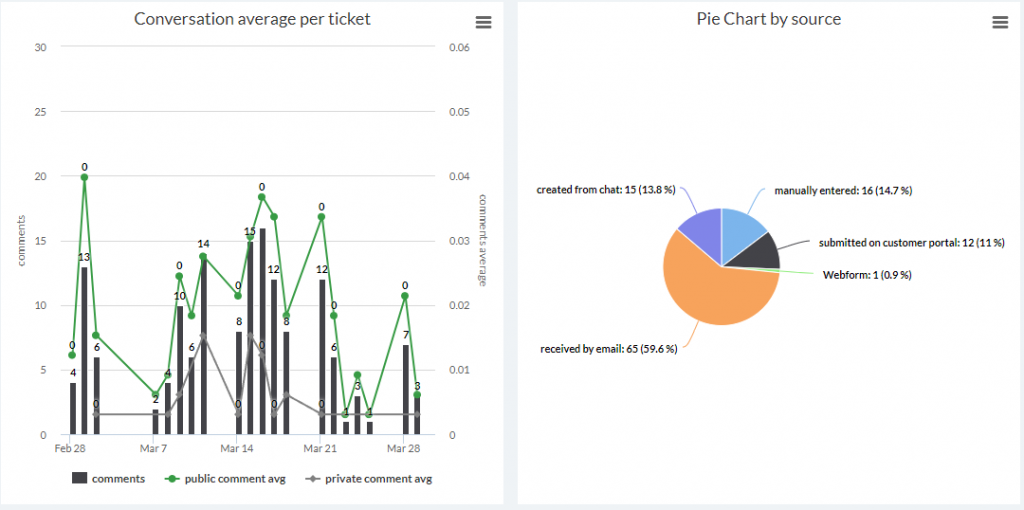
Customer Replies & Assignments –> “Conversation average per ticket”
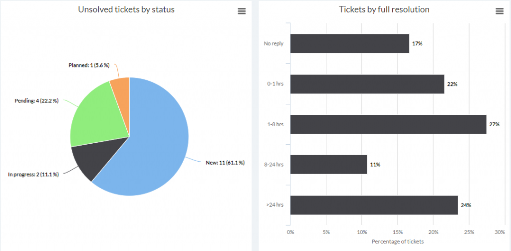
Customer Replies & assignments –> “Tickets by full resolution”
Current overview of tickets –> “Types”
Tickets Analysis –> “Pie chart by source”
Tickets change history –> “ Tickets created by date and source”
Dashboard: customer satisfaction
The purpose of this dashboard is to determine the quality and reliability of support customers are receiving. Make use of OneDesk’s built-in customer satisfaction surveys to elevate customer satisfaction and to best utilize this dashboard.
Customer replies and assignments –> “Tickets by full resolution”
Customer replies and assignments –> “Ticket by requester wait time”
Customer replies and assignments –> “Median full resolution and requester wait time”
Customer Satisfaction –> “Good vs Bad Satisfaction tickets”
Customer Satisfaction → “Satisfaction Score and rated tickets”
Dashboard: support team performance
The purpose of this dashboard is to analyze your support team’s performance, for instance the efficiency and consistency of ticket resolution.
Tickets change history → “Tickets created/solved”
Tickets change history → “Resolution time”
Current overview of tickets → “hours worked”
Items –> “Number of tickets created and solved by date”
Customer Replies and Assignments → “Tickets commented, created and resolved”
Customer replies and assignments → “Assignee updates”
Customer replies and assignments → “Median full resolution and requester wait time”
Unsolved tickets → “Tickets by full resolution”
Backlog → “Weekly unresolved tickets by status” OR “Daily unresolved tickets by status”

Dashboard: team workload
The following dashboard focuses on determining how busy your team is on both tickets and tasks.
Current overview of item → “workload”
Current overview of item → “hours worked”
Current overview of item → “assignees
Items → “hours worked by resource”
Items → “total hours worked”
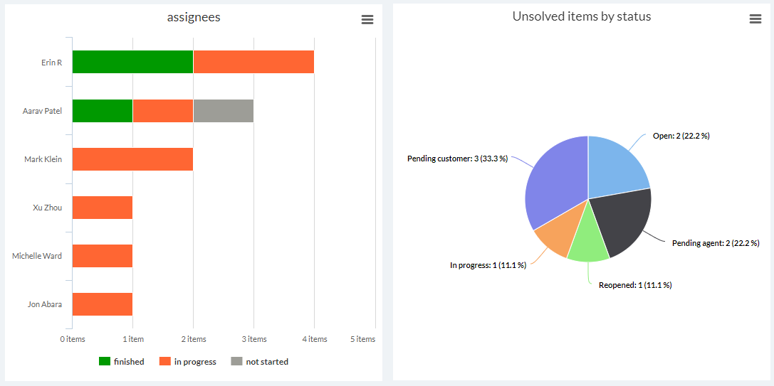
Unsolved Items → “Unsolved items by status”
Unsolved Items → “Unsolved items by assignee team”
Workload and time tracking → “Time tracking”
Dashboard: improve resource management
This dashboard features KPIs to improve resource management. Resource management refers to effectively planning and allocating time, skills, and resources. For instance, you may want to pinpoint the busiest time periods for support requests.
Items –> “Number of items created every hour”
Current overview of item → “Source”
Current overview of item →
Items change history → “Items created”
Items change history → “Average items created by day of the week”
Unsolved Items → “Unsolved items by item type”
Unsolved Items → “Unsolved items by assignee team”
Dashboard: general help desk analytics
This series of charts can serve as a general, all-purpose help desk analytics dashboard. Analyze and understand how many and where tickets are coming through as well as the general performance of your support team.
Tickets change history → “Recently created tickets”
Customer Replies and Assignments → “Tickets by first reply”
Customer Replies and Assignments → “Median full resolution and requester wait time”
Unsolved tickets → “Unsolved tickets by status”
Backlog → “Daily unresolved tickets by status”
Current overview of tickets → “source”
Dashboard: general project management
This dashboard serves as a general overview of the progress of your tasks and projects.
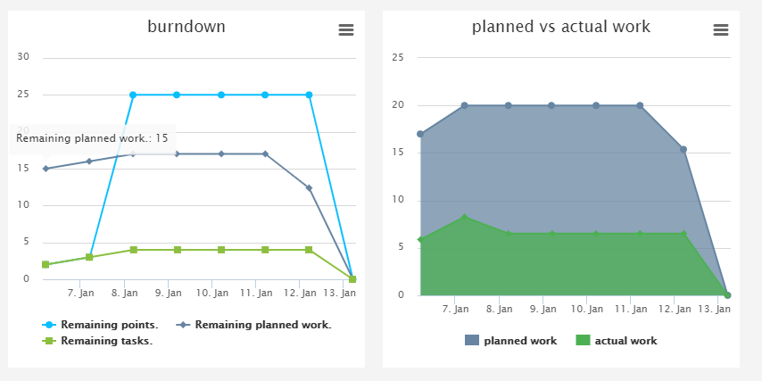
Items –> “Planned vs actual work”
Current overview of tasks→ “hours worked”
Current overview of tasks → “actual work per project”
Current overview of item –> “”% complete by project”
Current overview of item → “project items”
Current overview of item → “types”
Tasks change history → “Tasks created/solved”
Tasks change history → “Created vs resolved tasks”
Tasks change history → “Resolution time”
Backlog → “Weekly Unfinished tasks”
Dashboard: DevOps
This dashboard focuses on observing project and task performance over time, as well as the type and volume of end-user feedback.
Tickets change history → “Tickets created by date and item type”
Items → “Number of tickets created and solved by date”
Items change history → “Items created/solved”
Workload and time tracking → “Time tracking”
Backlog → “Weekly unfinished tasks by priority”
Items → ‘burndown by project”
Tasks change history → “Tasks created by date and item type”
Current overview of item → “Velocity”
Current overview of item → “project items”
Current overview of item → “% complete by projects”
Dashboard: agile project management
This dashboard is meant to guide and inform on projects following agile methodology.
Items → “burndown” AND/OR “burndown by project”
Current overview of item → “Velocity”
Items change history → Resolution Time
Current overview of item → “agile points vs. capacity”
Items change history → Time since items in progress ???
Items change history → Items created by date & item type ??
Current overview of item → “% complete by projects”
Current overview of item → “types”
Related Articles:
How to create a custom chart dashboard
That’s an amazing article.